
Ditching the formal but preserving its Britishness, Daniel Lee is leading Burberry towards a whole different branding direction.
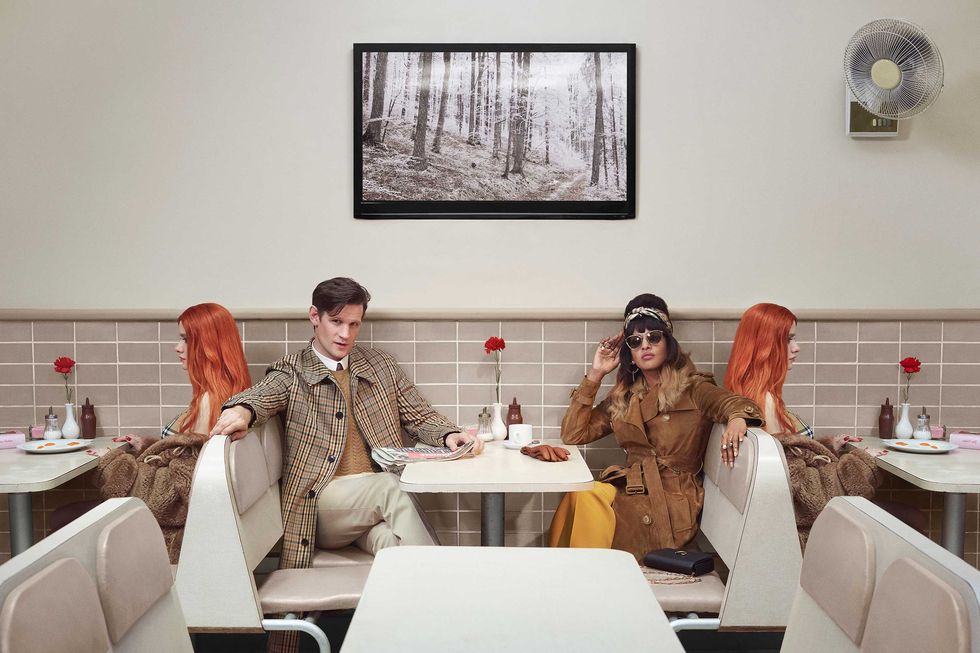
Guess the campaign: There’s a manor in the background, surrounded by vast fields of green and snowy hilltops at the horizon. The camera pans into a white horse, a girl dressed in a beige trench coat tending to it. Her hair’s straight, sleeked back. Next to her is a man, wrapped up in a brown and black tweed scarf and matching tweed gloves. The brand? It’s Burberry, of course.
Good brands do that kind thing. They become instantly identifiable by their staples, much like Chanel’s jackets or Fendi’s baguette bags. It’s a strategy that has worked for years, but things are changing. With an ever-demanding fashion scene that’s quick to forget and hard to ground-break, brands have free reigns on the playground to try, test and execute whatever they want. If they cause a large enough impact, it’ll stick. If it flops, people will forget about it within the week.
It was Burberry‘s turn this time.
The Re-Branding Itself
October saw Riccardo Tisci drop Burberry’s creative direction, only to be taken over by former Bottega Veneta mastermind, Daniel Lee. In a bold move, he wiped the brand’s social media clear, a popular move for those looking to start fresh, and only last week revealed a whole new imagery for the luxury house. Britishness permeates anything that Burberry does and this was no different. Set in unequivocally British landmarks and making use of their national talent, the campaign’s been causing a stir on socials.
The Logo
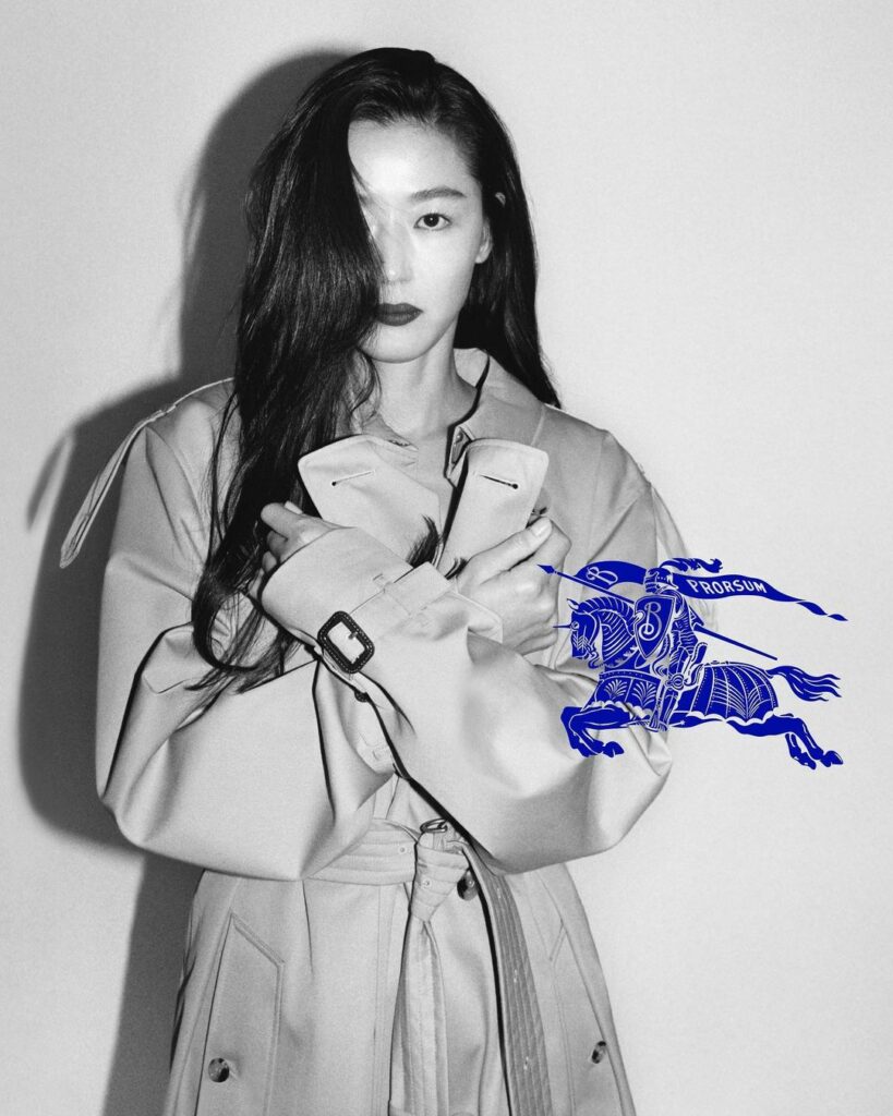
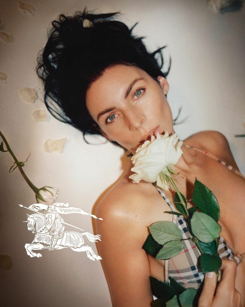
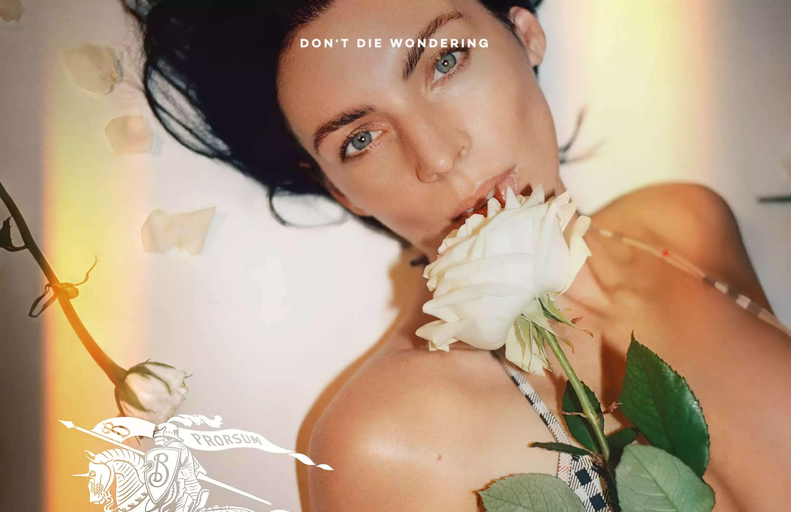
Fashion logos went minimal in the late 2010’s, but something in the air is making them re-evaluate their choices once again. Burberry, for starters, has decided to go back to their more regal-looking aesthetic, opting for a modernised version of their 1901 horse-riding knight, this time coloured in a royal blue. The font has also changed, opting for a modernised version of its regal origins.
The Photography
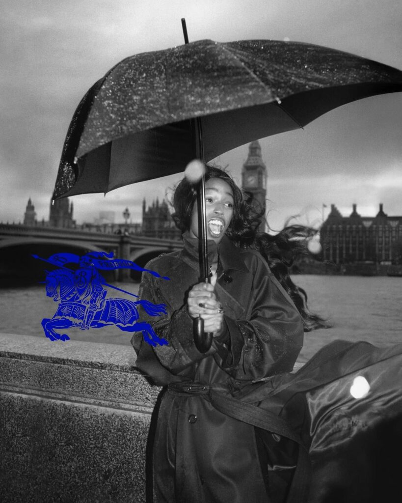
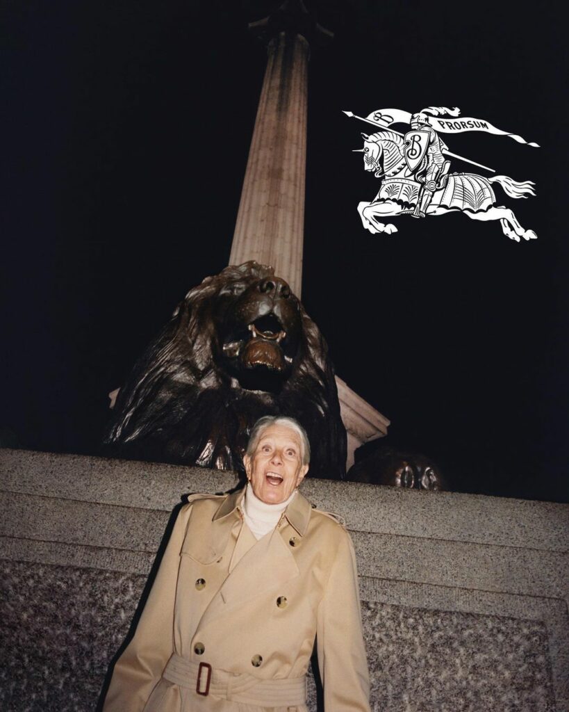
Imagery for the new Burberry 2023 rebranding is very Gen-Z, which opts for more casual compositions, poses and backdrops. The new generation has had enough overly curated studio imagery, instead preferring the seemingly less produced content (note, seemingly, because every minute detail has been planned to perfection, of course). This means photos taken in gloomy windy days, awkward angles and unscripted facial expressions. The result? A Burberry which shatters its previous formality and embraces a more playful aesthetic, fit for the times.
Love it or hate it, Burberry’s in for a change. The general consensus seems clear enough; people are loving the new imagery, and Burberry is back on the headlines after years of being outshined by the more provocative and adventurous counterparts of the fashion industry. We’re excited to see what changes this brings.


