

How globalisation, algorithms, and minimalism have engineered design’s relentless uniformity.
You’ve seen it. I’ve seen it. We’ve all felt that peculiar déjà vu that comes from scrolling through a feed or strolling down any high street. Every space, every brand, every surface now seems to speak in the same visual language: flat logos, sans-serif typefaces, and beige-toned restraint. Whether it’s a tech startup or an artisanal yoghurt brand, the aesthetic vocabulary has collapsed into a single dialect of tasteful neutrality, often trumping the very essence of branding by making it impossible to understand what a brand stands for, or sells.
This phenomenon reveals not mere stylistic convergence, but the imprint of systemic pressures on creative practice.

Globalisation: The Great Design Leveller
Globalisation promised connection through air travel, free markets and the internet: bedrock triumphs of modern life. What it ultimately delivered was an unprecedented exchange of information between people and corners of the world that had never crossed paths before. Beautiful as this exchange is, a consequence that the design world is now having to reckon with is the compression of our differences into uniformity. Ideas flowed freely, but so did aesthetics, eroding what makes design, as I see it, sing: its rootedness in place and culture. Once, logos drew from local nuance and market character. Now global economies demand universal appeal, yielding the same neutral palettes, clean lines and logos reduced to abstraction.
Economically, the logic holds. Brands chasing sales from Tokyo to Timbuktu to Tunbridge Wells default to the universally inoffensive. Neutrality sidesteps alienation, courts every wallet. Yet luxury houses grasp what mass markets ignore: appeal to all, captivate none.

The Optimisation Trap
The digital age brought social-media algorithms, the invisible governors of today’s visual culture. Platforms from Instagram and TikTok to Pinterest (that endless repository of “inspired” ideas) prioritise content that racks up likes, shares and engagement.Predictable formats prevail, their triumph assured by systems of starkly limited discernment. Designers, hungry for reach, reverse-engineer these preferences, copying what thrives and trapping creativity in loops of replication.
Consider a designer scanning last week’s Instagram standout: a sleek sans-serif, impeccably minimalist, now adjusted to a warmer beige. Brenda in New York likes it. So does Carmen in Peru. Lucille in Australia. Suddenly, the post has amassed thousands of likes and shares. From there on, the downwards spiral goes something like this: peers swiftly follow, each variation barely perceptible. Feeds soon brim with these near-identical motifs. A platform once devoted to daring expression has become a homogenising apparatus.
The Minimalist Stranglehold
Minimalism arrives next: once the creed of design radicals purging excess for purity and function. Its mantra less is more has, in branding’s grip, curdled to less is bland.
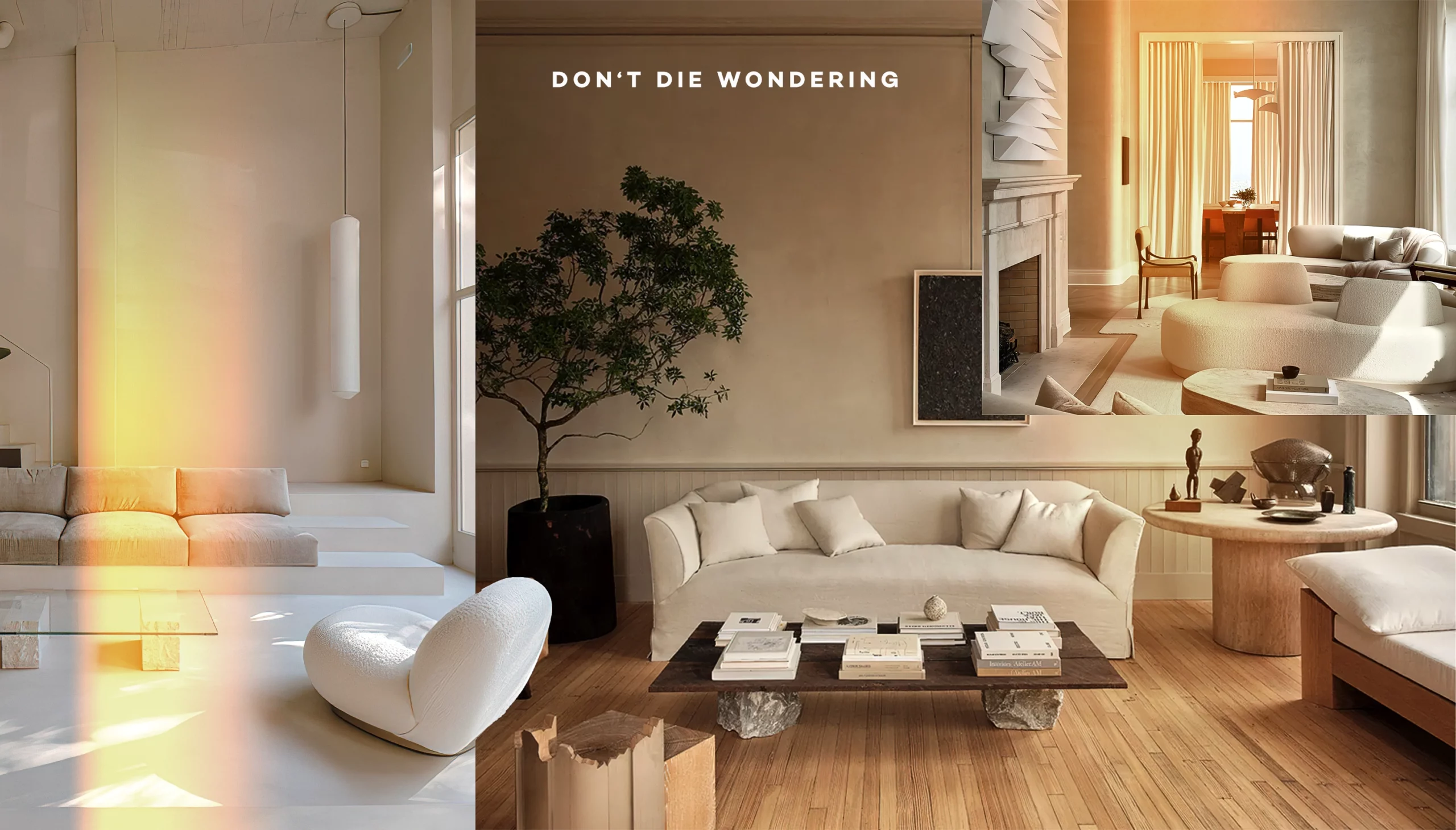
The late philosopher Robert Pirsig warned that stripping to bare function erodes something vital. This aesthetic endures not by accident, but as capitalism’s perfect handmaiden. Space commands premium; decoration and excess, proscribed luxuries. In a world of stacked shelves and screen real estate, minimalism enforces efficiency, rendering every surface legible, scalable, frictionless. Logos and sites fade into safety – neutral tones, sans-serif restraint – demanding no invention beyond palette selection. Functionality trumps delight; what thrives is forgettable, primed for endless replication across platforms and markets. It is the diet of beige: a diet that rarely offends — or excites.
Design’s Uniformity and the Erosion of Self
Homogenisation extends beyond brands to assail our own sense of place. “Blanding” (branding devoid of character) has bred a visual monoculture: flat geometries, neutral tones, sterile typefaces. Architecture, fashion, domestic interiors – all succumb to the same pallor.
Daily immersion in this sameness dulls our capacity for recognition. How does one forge connection with a brand, a product, a space when all blur into interchangeability? Designs once narrated stories, mirrored cultural lineage; now they conform to global blandness. Personality recedes, quirkiness vanishes, the cues of uniqueness dissolve – leaving environments as indistinct as their makers intend.
Escaping Uniformity
How might design reclaim distinction? Reject algorithmic fixation and mass appeal, for a start. Certain brands already diverge: Chobani’s 2017 rebrand swapped minimalism for a chunky retro serif, warm and defiant against the beige tide. Burberry, under Riccardo Tisci, briefly embraced bold monograms and angular serifs over whisper-quiet luxury. Mailchimp ditched safe sans-serif for quirky, hand-drawn typography. Each proves distinction still sells, perhaps better than safety ever could.
Craftsmanship offers another path. Aesop designs every store uniquely, using local materials and craftspeople: reclaimed timber in Melbourne, terracotta in São Paulo, brutalist concrete in Hong Kong. Their tactile brown bottles and embossed labels demand to be touched. Local artisanship, culturally rooted forms, tactile media…each counters visual monotony. When brands prioritise authentic narratives over globalised norms, diversity re-emerges, restoring design’s capacity to provoke and belong.
Beyond the Beige Horizon
Design’s sameness is no stylistic accident, but the inevitable outcome of globalisation, algorithmic governance, and capitalism’s appetite for scalable neutrality. These forces don’t merely influence aesthetics, but reshape what’s creatively possible, commercially viable and culturally legible.
Yet resistance emerges. The brands reclaiming distinction prove that audiences crave connection over conformity, character over compliance. Reviving design’s vitality demands rejecting the false choice between global reach and local soul. It requires designers to prioritise provocation over performance metrics, craft over clicks, belonging over bland ubiquity.
The beige horizon needn’t be permanent…if we choose to look beyond it.